
Data
Analysis

Data analysis is defined as a process
of cleaning, transforming, and modelling data to discover useful information
necessary for decision making. Data analysis can further be defined as a process
of evaluating data using analytical or statistical tools to discover useful
information.
Data analysis can be done using Various programming languages e.g. Java, C++, Python, R, Julia etc.In recent years, Python has increasingly become a popular tool for data analysis surpassing all the other languages such as R and Java.One of the reasons for this growing interest in python is because of the tons of easy to use data-centric libraries and packages such as Numpy, pandas, Pillow, Matplotlib, etc. that make the process of data analysis a steady flow.
Data analysis can be done using Various programming languages e.g. Java, C++, Python, R, Julia etc.In recent years, Python has increasingly become a popular tool for data analysis surpassing all the other languages such as R and Java.One of the reasons for this growing interest in python is because of the tons of easy to use data-centric libraries and packages such as Numpy, pandas, Pillow, Matplotlib, etc. that make the process of data analysis a steady flow.
By the end of this post, I will have demonstrated
how to use python for data analysis with a sample GUI-code. You will be able to use the same code to carry out you own data analyses
Before proceeding, make sure that you have a working version of Anaconda. If not, download and install the latest version of anaconda from here

Anaconda
is a free and
open-source distribution of the Python and R programming languages for
scientific computing, that aims to simplify package management and deployment.
It is developed and maintained by Anaconda, Inc.
Once you download and install anaconda, it will be a smooth flow. Simply because all the packages we shall cover in this post are already pre-installed in anaconda. Actually you do not need to any programming background to learn this.
Once you download and install anaconda, it will be a smooth flow. Simply because all the packages we shall cover in this post are already pre-installed in anaconda. Actually you do not need to any programming background to learn this.
For this, demonstration, you do not have to worry. I
have already written and compiled code for you. Most importantly, this code is
enabled with a Graphical user interface, all you need to do is to learn how to
use the source code provided for your own data analysis.
To achieve this, we shall use an extract of the
COVID19 Situation reports (source: WHO) for the 21st April 2020 in
the European region. Download and open this excel sheet from here. The excel
work book contains details of Total deaths of COVID19, Total confirmed Cases
and New cases of COVID19 recorded on that day at a country level (Europe).
Download the excel sheet from here and save it on your computer
Further download the attached Jupiter notebook from here. And open it in a Jupiter environment in Anaconda.
We shall use the note book to do various plots, and analyses necessary to get an in depth understanding of the COVID19 situation.
This window contains five sub windows i.e., File, Plots, Regression and Help. This script can be used to open and analyse csv excel files.

Scatter plot: a graph in which the values of two variables are plotted along two axes, the pattern of the resulting points revealing any correlation present.
Step 3: To compute the correlation coefficient between two variables, Click correlation ->compute. Use the window below to select the independent and dependent data frame, plus the correlation method
Step 4: Computing regression equations.

This notebook can be used to compute Linear, Quadratic and Cubic equations. Select any you may want to use. for demonstration we shall select compute the Quadratic regression model between Total deaths and Total Cases of COVID19
Select the y Variable (Total deaths) and x variable as Total cases. Use the %Train option to divide your dateset into training and testing data randomly. In this case we use 60% of the data for trainning. The algorithm will use the test proportion (40%) to compute an R_squared value for the estimated equation. Further, you can compute the Linear and Cubic regression in the same way.
Step 5: Use the help menu to access miscellaneous services

After this simple demonstration, i hope you can further use this code in your other data analyses.Feel free to also share this script with a friend.
Special thanks goes to The Department of Geomatics and Land Management (Makerere University), Nepal Applied Mathematics and Informatics Institute and Tricksgum Inc plus all those other websites i have gathered information and skills that helped me to publish this. Feel free to share with others the notebook.
In case of any question, advice and submission contact us on emai at jessebuyungo48@gmail.com
follow us on Facebook @atomgeospatialsolutions
Further download the attached Jupiter notebook from here. And open it in a Jupiter environment in Anaconda.
 |
| Snapshot from the notebook |
About the notebook
This data analysis notebook has been developed using
various libraries i.e Tkinter, Pandas, Numpy, Matplotlib, Seaborn and Sklearn.
Tkinter has been used to make a graphical user interface to the code to make it easily usable by all people. Numpy has been used in all matrix and array manipulation operations.
For making high quality visualizations, Seaborn and matplotlib libraries have been used.
Pandas has been used for handling the excel sheets while Sklearn has been used for correlation and regression computations.
We shall use the note book to do various plots, and analyses necessary to get an in depth understanding of the COVID19 situation.
Data Analysis Procedure
Step 1: Open and run the notebook (Data
analysis.ipynb). Once you run this notebook, an new window will pop out shown
in the window below.
 |
| A data analysis window pop up |
This window contains five sub windows i.e., File, Plots, Regression and Help. This script can be used to open and analyse csv excel files.
Click file and navigate to the location of the downloaded excel file (covid_19_21_04_2020_Europe)
and open it
 |
| opening a csv file |
The data frame will be opened in a new window as
shown below. Use the window below to get examine the data
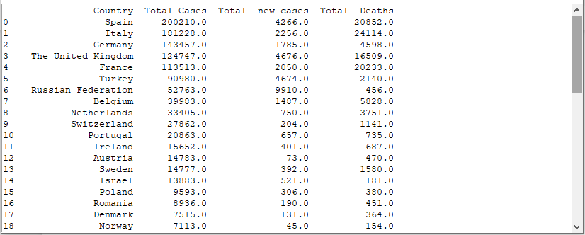 |
| COVID19 extract |
Step 2: Click Plots. the plot menu contains various plots necessary for data analysis.
Scatter plot: a graph in which the values of two variables are plotted along two axes, the pattern of the resulting points revealing any correlation present.
Correlation Plot: is a graph of correlation
matrix. It is very useful to highlight the most correlated variables in
a data table
Line plot : is a chart which displays
information as a series of data points called 'markers' connected by straight
line segments.
Regplot: It is used to plot a regression line between and dependent and independent Variable. The relationship can be linear, quadratic,cubic, logarithmic e.t.c
Histogram: Is a graph to show frequency distributions
Bar graph: is a chart or graph that presents categorical data with rectangular bars with heights or lengths proportional to the values that they represent
Histogram: Is a graph to show frequency distributions
Bar graph: is a chart or graph that presents categorical data with rectangular bars with heights or lengths proportional to the values that they represent
To plot a graph, select the plot type, Select the x and y variable from your data frame and
also the title of the plot. Click the Plot Graph Button to get a visualization.
 |
| Histogram plot |
 |
| Line graph plot |

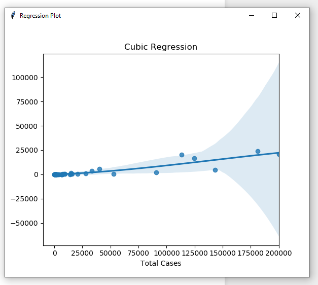 |
| Cubic regression plot |
 |
| Quadratic regression plot |
 |
| Linear regression plot |
 |
| Scatter Plot |
Step 3: To compute the correlation coefficient between two variables, Click correlation ->compute. Use the window below to select the independent and dependent data frame, plus the correlation method
 |
| Computing the Pearson coefficient between Total cases and total deaths |
Step 4: Computing regression equations.
This notebook can be used to compute Linear, Quadratic and Cubic equations. Select any you may want to use. for demonstration we shall select compute the Quadratic regression model between Total deaths and Total Cases of COVID19
 |
| Computing the quadratic relationship Total deaths and total cases of COVID19 |
Select the y Variable (Total deaths) and x variable as Total cases. Use the %Train option to divide your dateset into training and testing data randomly. In this case we use 60% of the data for trainning. The algorithm will use the test proportion (40%) to compute an R_squared value for the estimated equation. Further, you can compute the Linear and Cubic regression in the same way.
Step 5: Use the help menu to access miscellaneous services
After this simple demonstration, i hope you can further use this code in your other data analyses.Feel free to also share this script with a friend.
Special thanks goes to The Department of Geomatics and Land Management (Makerere University), Nepal Applied Mathematics and Informatics Institute and Tricksgum Inc plus all those other websites i have gathered information and skills that helped me to publish this. Feel free to share with others the notebook.
In case of any question, advice and submission contact us on emai at jessebuyungo48@gmail.com
follow us on Facebook @atomgeospatialsolutions


0 Comments